
Two-Tier Medallion Architecture Fabric: Bronze + Combined Silver-Gold, A Real Example
A working two-tier medallion architecture Fabric implementation built in Microsoft Fabric, from raw file landing to Power BI reporting.
If you are evaluating a two-tier medallion architecture Fabric implementation, this real-world example demonstrates how to design an incremental, scalable Microsoft Fabric data platform.
Most explanations of medallion architecture stop at a diagram - three coloured boxes labelled Bronze, Silver, and Gold, with arrows between them. It looks clean on a slide. It rarely shows what the pattern looks like once real files, real dates, and real reporting deadlines are involved. This post walks through a genuine Microsoft Fabric medallion architecture example - specifically a two-tier variant, where Bronze lands raw files in a Lakehouse and Silver and Gold are combined into a single Warehouse layer rather than kept as two separate tables. New York City's public taxi trip data is ingested, cleaned, enriched, and served into a Power BI report - the same shape of pipeline data teams build for finance, operations, or customer data every day.
This is a two-tier medallion pattern: Bronze (raw Parquet files in the Lakehouse) feeds directly into a combined Silver-Gold table in the Warehouse, rather than passing through a separate intermediate cleansing layer first. It's a reasonable simplification when transformation logic is light - production builds with heavier cleansing rules would typically split Silver and Gold into two distinct tables. This post covers the two-tier structure and layer design; if you want the details on how the pipeline decides which file to process next, that's covered separately in our incremental ingestion and watermarking post.
This is written for data leaders, analytics managers, and IT decision-makers evaluating whether Fabric's Lakehouse-plus-Warehouse pattern is worth adopting - not a line-by-line developer tutorial. If your team is weighing Fabric against a traditional data warehouse build, or trying to picture what "incremental loading" actually looks like in production, this is the walkthrough for you.
The Business Problem This Project Solves
New data arrives every month. A pipeline that only knows how to reprocess everything from scratch gets slower and more expensive with every file added. The real engineering challenge in almost every medallion build isn't landing the first month of data - it's landing the second, third, and thirteenth month without reprocessing everything that came before, without duplicating records, and without breaking the report that leadership already relies on.
This project mirrors exactly that scenario using New York City's monthly taxi trip files, but the pattern is identical to a monthly sales extract, a weekly claims file, or a nightly transactional export from any line-of-business system.
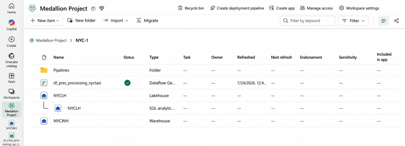
The Fabric workspace: a dedicated Lakehouse landing raw Parquet trip files, one folder per data type.
Two-Tier Medallion Architecture Fabric: Lakehouse, Warehouse, and the Medallion Flow
The build combines four Fabric experiences into one workflow: Data Engineering (Lakehouse), Data Factory (pipelines and Dataflows), Data Warehousing (staging and presentation tables), and Power BI for the reporting layer. Rather than routing data through a separate intermediate layer before presentation, this build simplifies the middle step - staging feeds presentation directly, cleansed and enriched in a single pass. It's a reasonable simplification for a learning-scale project; production builds with heavier transformation logic would typically add a dedicated Silver layer table in between.
Bronze = raw Parquet files landed in the Lakehouse. Staging = a Warehouse table holding the current month's raw rows before cleansing. Presentation = the Gold layer table Power BI reports against, holding full history.
Bronze Layer: Landing the Raw Data in OneLake
Each monthly trip file is downloaded as a Parquet file and uploaded into the Lakehouse under a dedicated folder. A second folder holds a static taxi-zone lookup file - a one-off load that never changes, so it's processed once, outside the recurring pipeline. This separation matters: not every table in a medallion build needs the same refresh cadence, and treating a static reference table the same as a fast-changing transactional table is a common source of wasted pipeline runs.
From there, a Data Factory copy activity loads the lookup file into a staging schema in the Warehouse, and a second pipeline copies the monthly trip file into a staging table - with the file path built dynamically from a pipeline variable, so the same pipeline can process any month simply by changing one value.

The staging pipeline: a copy activity with a dynamic date variable determines which month's file gets processed.
Staging to Presentation: Cleansing, Enrichment, and Watermarking
Raw trip data on its own isn't reportable. Vendor and payment type arrive as numeric codes; pickup and drop-off locations are just IDs. A Dataflow Gen2 step joins the trip data against the zone lookup table twice - once for pickup, once for drop-off - to resolve borough and zone names, and adds conditional columns that translate vendor and payment codes into readable labels.
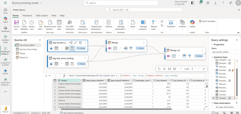
The Dataflow Gen2 diagram view: merging trip data with the zone lookup table and adding readable vendor and payment columns.
A metadata table - a processing log - records every pipeline run: the pipeline run ID, which table was processed, how many rows, the latest pickup date in that batch, and when it ran. This log is the mechanism that lets the pipeline always know exactly which month to process next, without a human checking or hardcoding a date each time.
A processing log isn't overhead - it's what turns a one-off data load into a pipeline that can run unattended, month after month, without reprocessing what's already there.
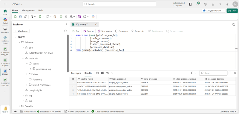
The processing log: every pipeline run recorded with row counts, latest processed date, and run ID.
Handling Incremental Loads Without Reprocessing Everything
This is the core pattern worth studying. Before each run, a script activity queries the processing log for the latest date already processed, adds one month to it, and formats the result into the file-path pattern the pipeline expects. That value is stored in a pipeline variable and used to determine which file gets ingested next - automatically.
The staging table itself is deleted and reloaded every run, since it only ever needs to hold the current month's data. The presentation table, by contrast, is always appended to - never overwritten - so it accumulates full history while staging stays lean. A stored procedure also removes any rows falling outside the expected date boundaries before they reach presentation, catching stray or duplicate records from the source file.
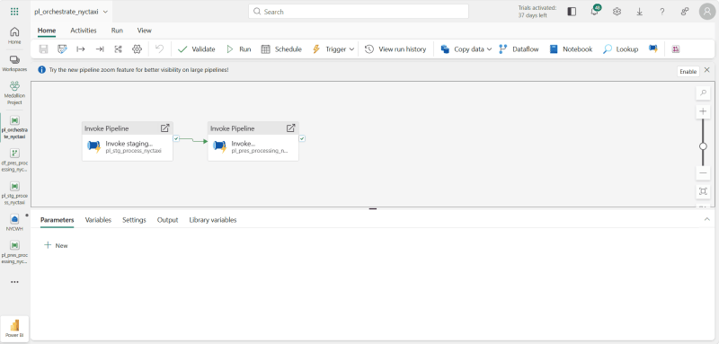
One orchestration pipeline chains the staging load and the presentation load - this is what would be scheduled to run monthly.
The Payoff: A Live Power BI Report Fed by the Pipeline
Once the presentation table is exposed through the default semantic model, a Power BI report sits directly on top of it - KPIs for total revenue, trip count, and passenger count, a daily revenue trend by payment method, and a table of the most common pickup-to-drop-off routes. Every time the orchestration pipeline runs and a new month lands, refreshing the report brings the new month's data straight into the visuals, with no manual rework.
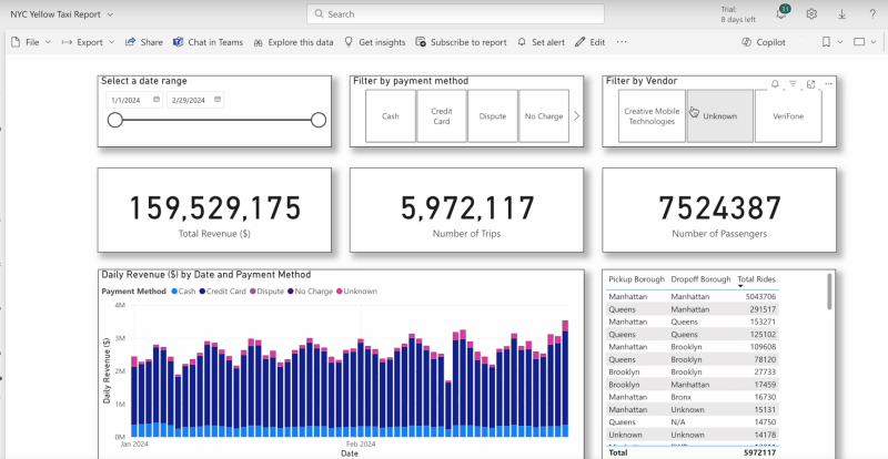
The Gold layer's payoff: a Power BI report that updates automatically as each new month lands through the pipeline.
- A medallion architecture is only as good as its incremental-load pattern - without a watermark mechanism, every new file means reprocessing everything.
- Bronze doesn't need transformation logic - it just needs a reliable landing zone and a folder structure that separates static reference data from fast-changing data.
- A processing log table is a small addition that turns a manual pipeline into one that can run unattended on a schedule.
- Collapsing Silver and Gold into one table keeps the build simple - but it's a trade-off worth naming explicitly, not a default to fall into by accident.
- The real test of a medallion build isn't the first load - it's whether the pipeline still works cleanly on month thirteen.
What This Means for Your Organisation
The diagram version of medallion architecture is a starting point, not a finish line. The real value shows up in the details this walkthrough covered: how a pipeline knows what to process next, how static and transactional data get treated differently, and how the same logic can be built two different ways with a real, measurable performance gap between them. If your team is planning a Fabric migration or standing up a new data engineering pipeline, these are the questions worth asking before the first line of code is written - not after the first production incident.